

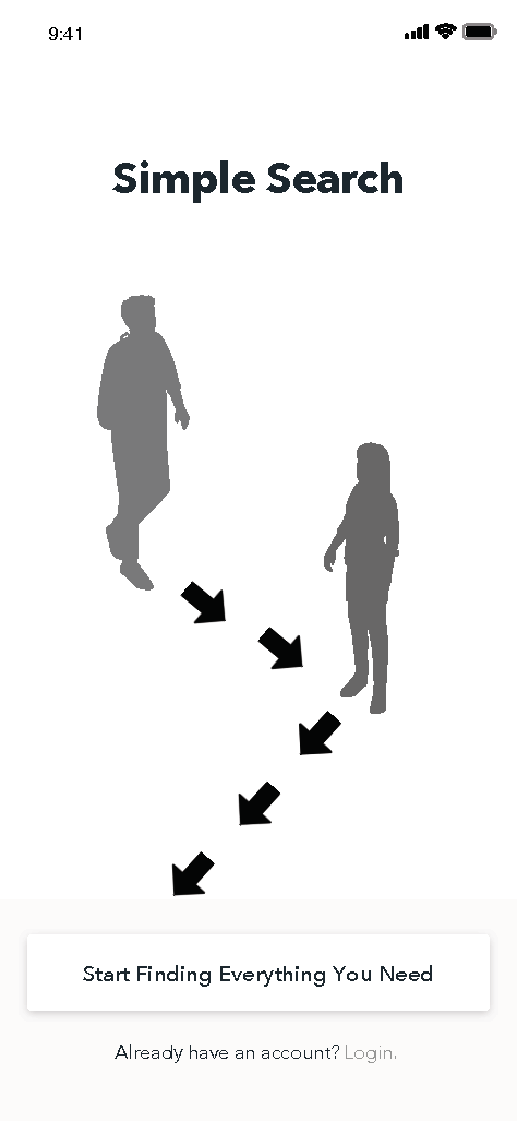
Simple Search
Elevating the overall audience experience, this application transforms users from ordinary audience members to VIPs.

Mobile App
Simple Search is a platform designed to minimize physical contact and unnecessary wandering during in-person concerts and theater performances, all while enhancing the overall audience experience. Its primary goal is to offer a seamless, one-touch solution for all the services required to attend shows.
The Problem
Users must prioritize safety while enjoying live shows, ensuring they remain in their designated seats as much as possible to minimize contact with others and uphold accurate contact tracing measures.

The Solution
Utilizing research analysis, I conceived an app that establishes a virtual bathroom line, empowers users to navigate the venue independently, and facilitates food delivery directly to their assigned seats.
Role
Sole Researcher
UX Designer
UI Designer

Project Type
Community Service
Non-profit
How might we enable audiences to safely attend live music and theater performances amidst social distancing measures?
In this case study, I will guide you through the process of researching, discovering, and validating concepts aimed at ensuring the safety of attendees in a physical space during the Covid-19 pandemic.
Our focus was on identifying target users, understanding their needs, finding a balance with the prevailing social distancing policies, and translating these insights into the design of a mobile app.
-

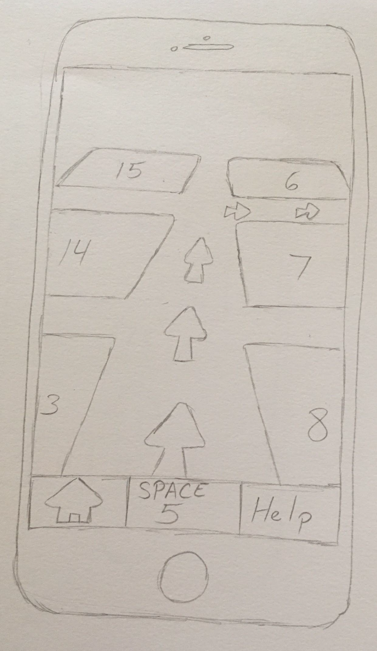
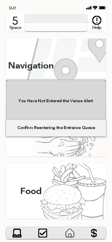
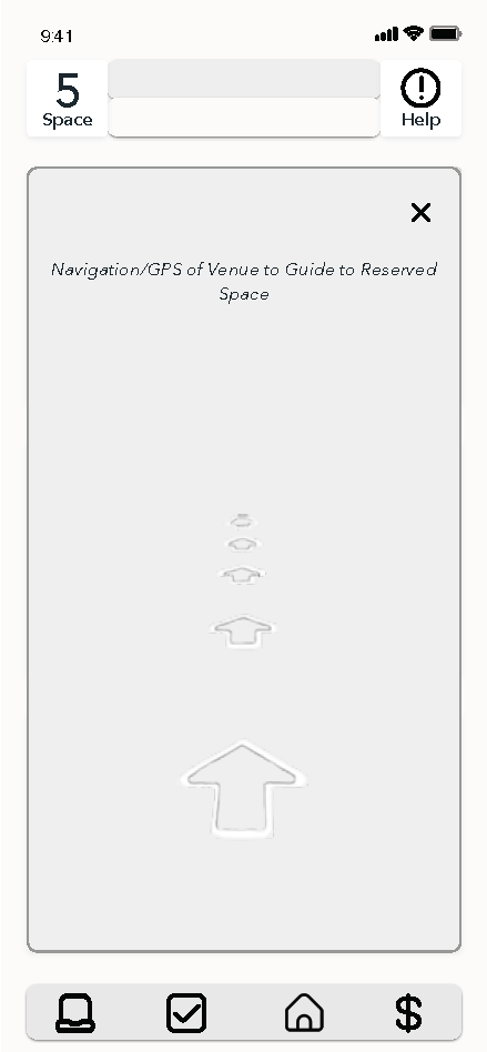
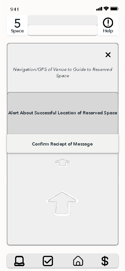
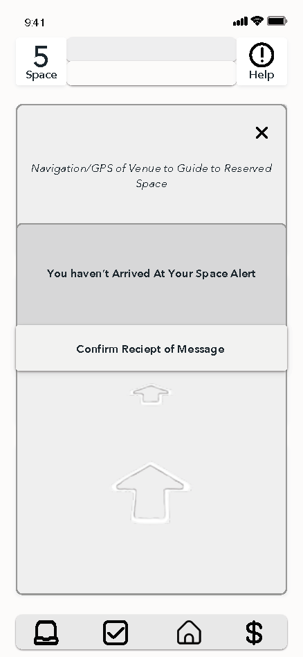
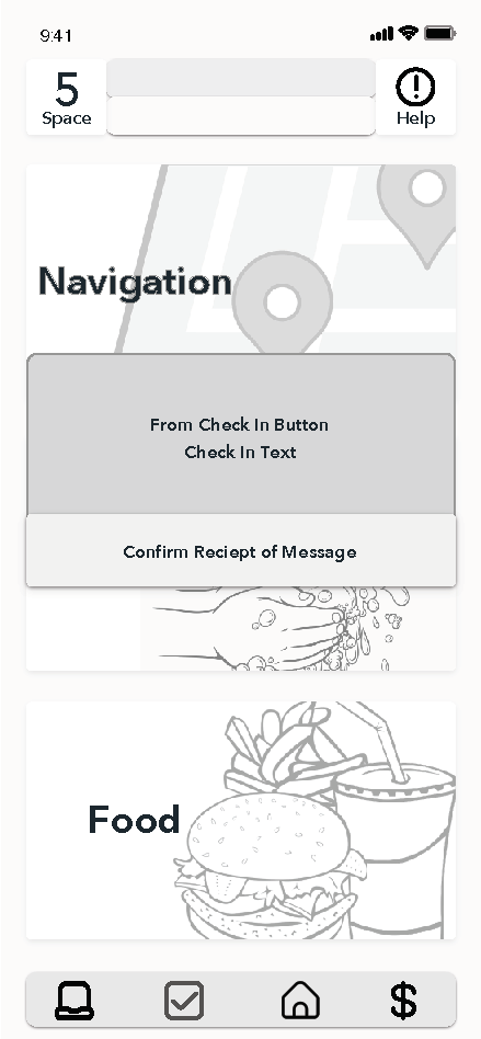
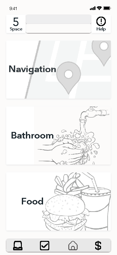
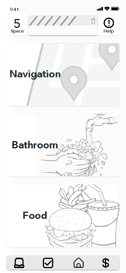
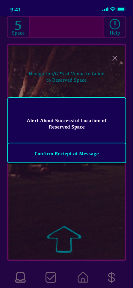
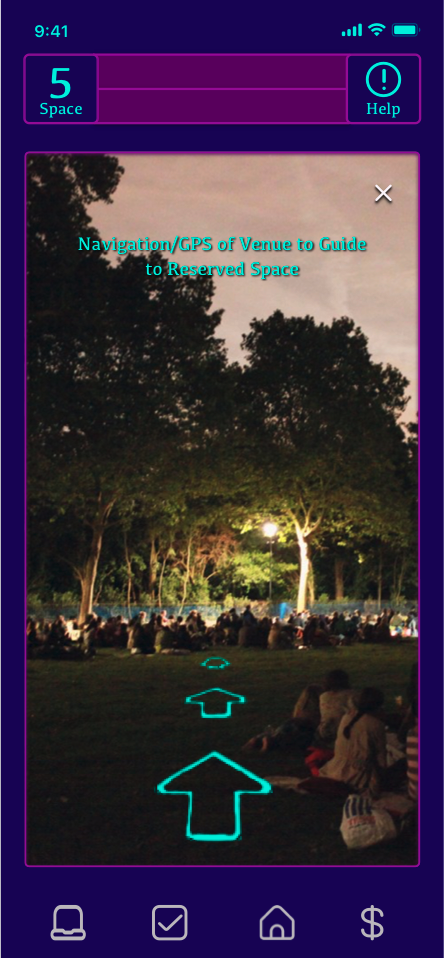
Navigation
Navigating the venue independently, eliminating the need for staff assistance, and ensuring minimal wandering within the space.
-

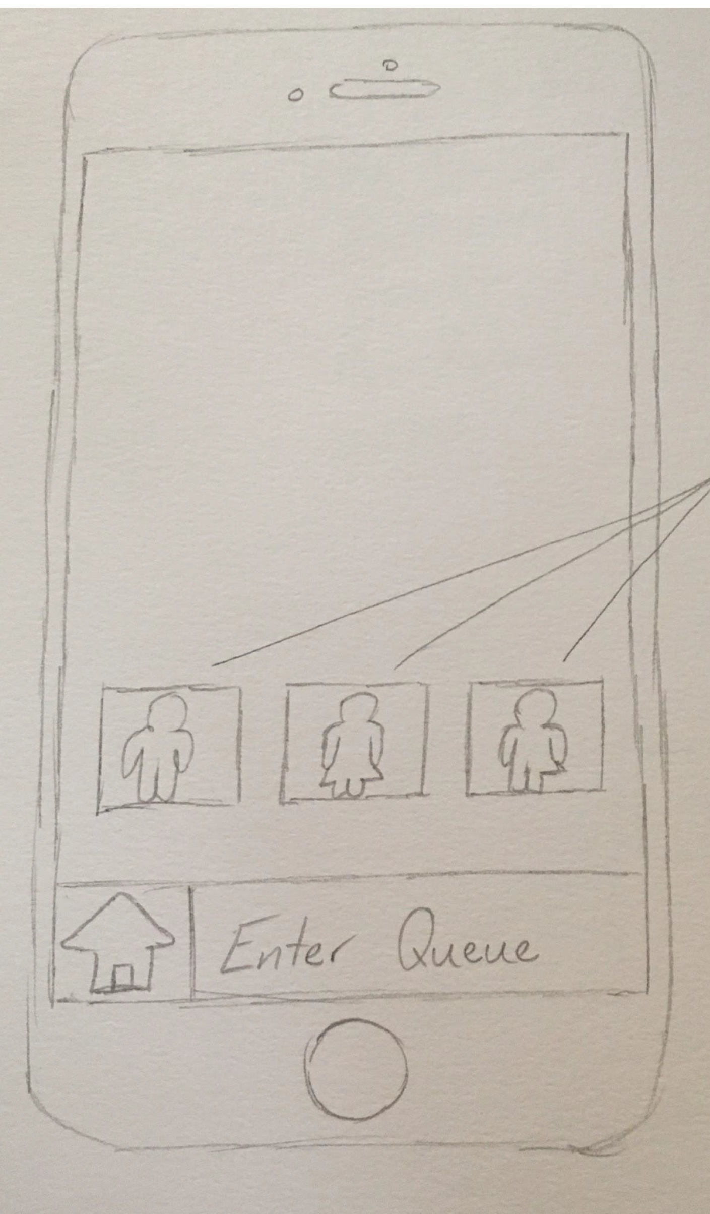
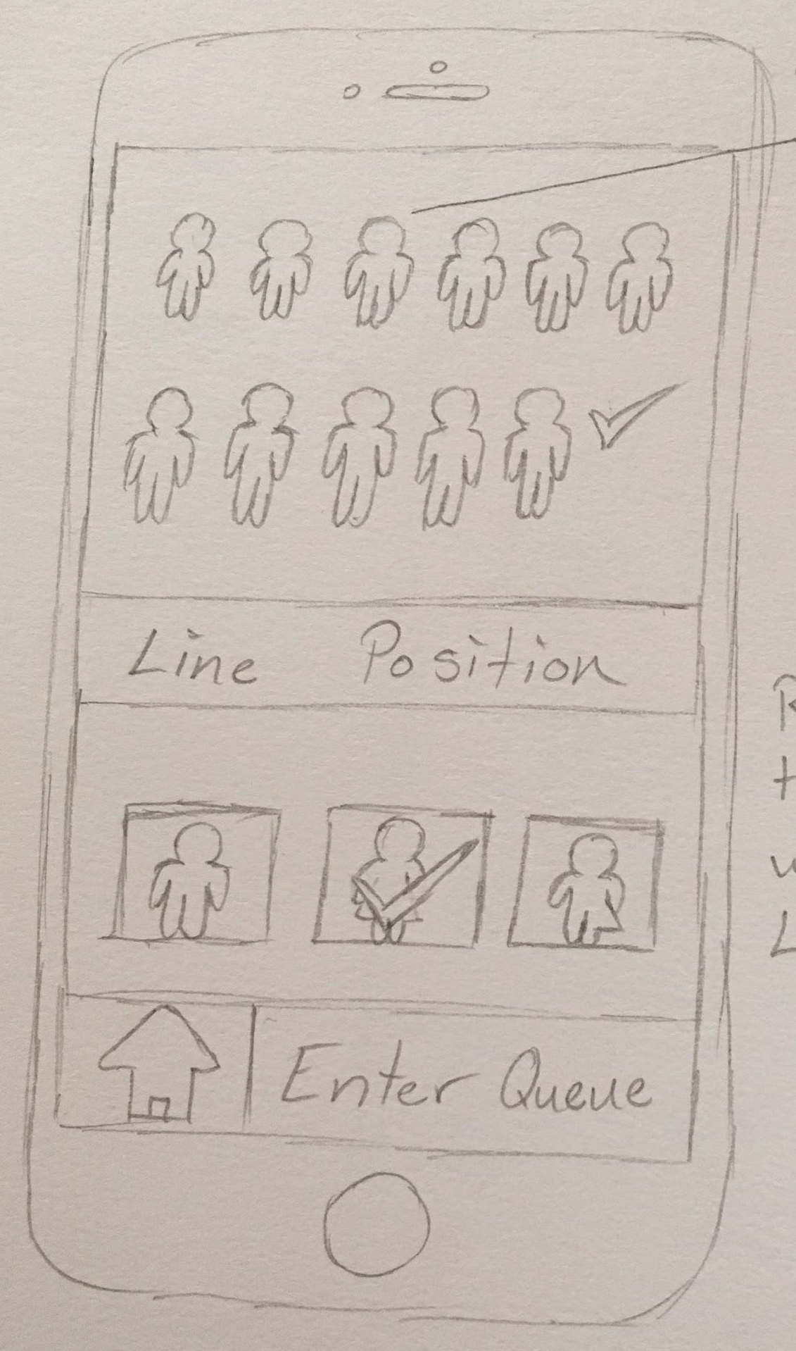
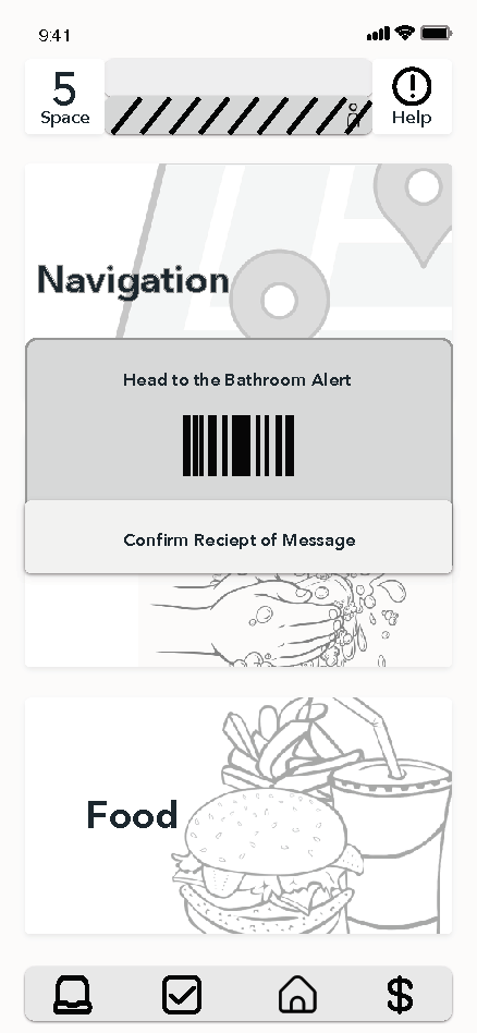
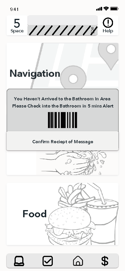
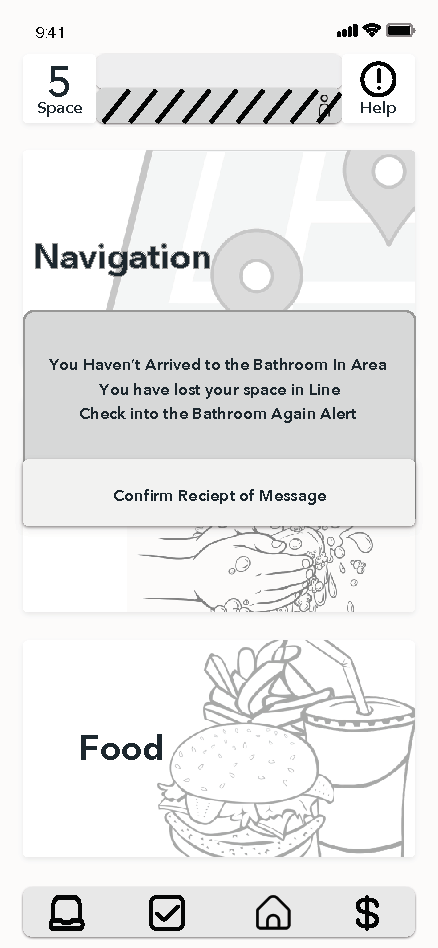
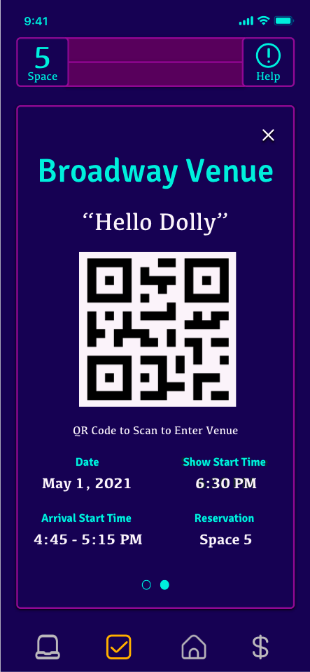
Bathroom
Secure your spot in the bathroom line without leaving your seat. Enjoy more of the how, only stepping away when it's your designated time.
-

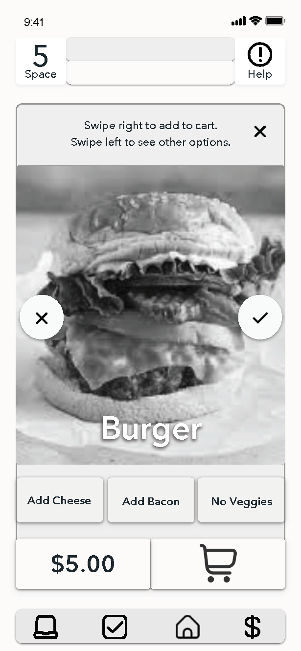
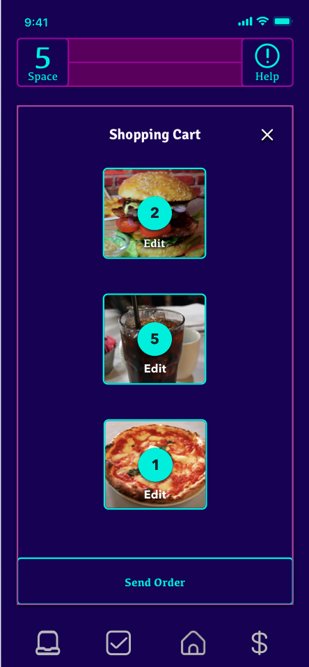
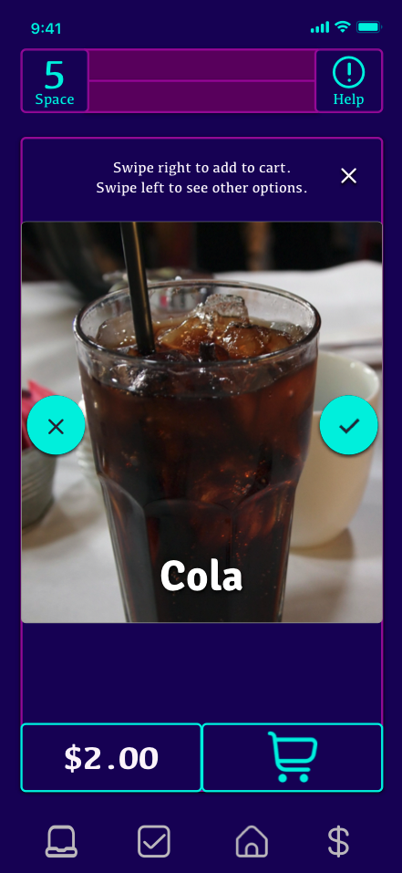
Food
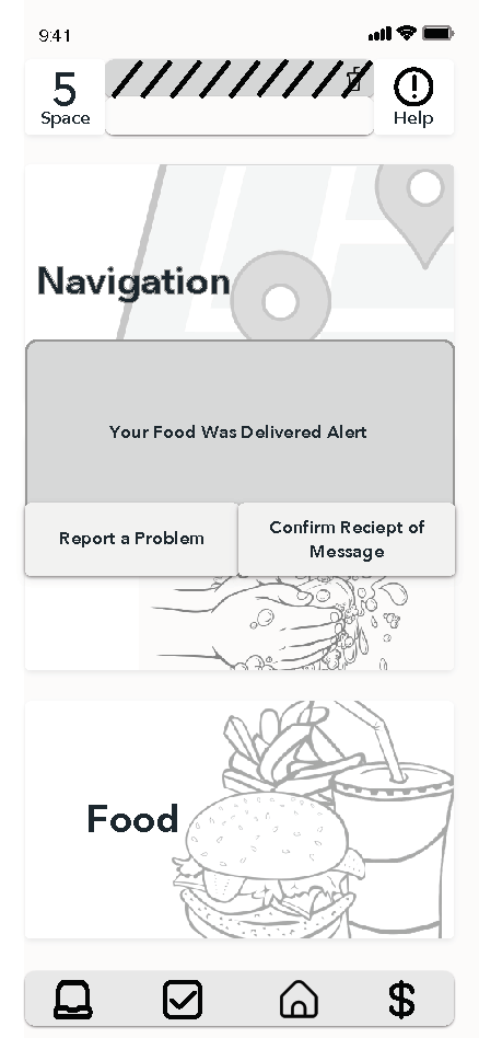
Have food delivered to your seat. Another way to never miss a single second of the show.
Simple Search Prototype
Leveraging Sketch and XD, Simple Search underwent prototyping to identify optimal icons, navigation, and visual cues, facilitating users in seamlessly transitioning into expert usage.
Research
After soliciting a screener seeking individuals who use smartphones and attend live theater and/or concerts, five survey participants were selected, meeting the necessary criteria for conducting interviews. These individuals disclosed specific needs and concerns that the project had not initially taken into account.

Interviews
Five potential users, spanning diverse demographics, were interviewed based on specific criteria: having attended a live show between 2017-2019, falling within the age range of 18-65, and possessing a smartphone.
Learn More

Affinity Mapping
Quotes and observations from the interviews were collected and systematically categorized into common concepts. This process aided in recognizing overlapping needs and concerns, ultimately defining the scope of the project.

Empathy Mapping
The majority of interviewed users shared similar needs and concerns, with one notable difference—concert attendance. This distinction necessitated the creation of two separate maps to address specific user requirements.
Personas
Both personas are nearly identical, differing only in their approach to concert attendance. Both prioritize safety, but one prefers to wait until concerts return to normal. This variation is determined by age
Learn More
The Stats
2.7 Million
Jobs lost due to the Covid-19 pandemic
$150 Billion
In Sales of Goods/Services Lost
9 out of 10
Venues closed their businesses permanently
$9 Billion
Estimated Loss Concert Industry Revenue
Storyboards and Sketches
Storyboards and sketches were compiled to outline the essential user pathways ("red routes") and streamline the creation of digital mock-ups, saving valuable time in the design process.
Concept Storyboards
Visual representations of the app's interface and functionalities were compiled to maintain a clear focus on the users' needs and requirements.

Original Interface Concept


Concept Sketches
The app's layout was conceptualized with the understanding that users attending a performance needed to quickly locate features without engaging in extensive interactions. The goal was for the app to enhance the experience rather than distract from it. To assess the design's practicality and identify areas for improvement, the Marvel App was employed to address major issues.
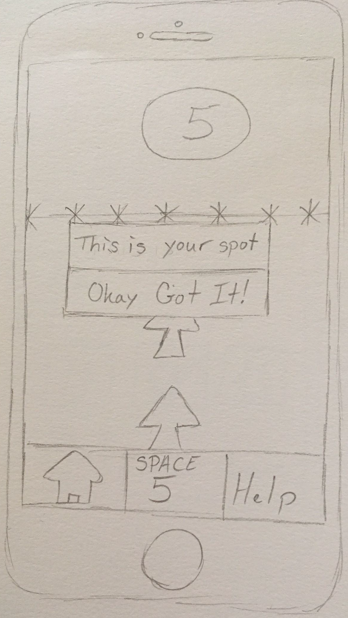
Wireframes, Red Routes, and Wireflows
Following crucial feedback on the initial mock-up created using storyboard images, we proceeded to develop wireframes and a wireflow. This encompassed the incorporation of specific edge cases deemed crucial to the overall design.
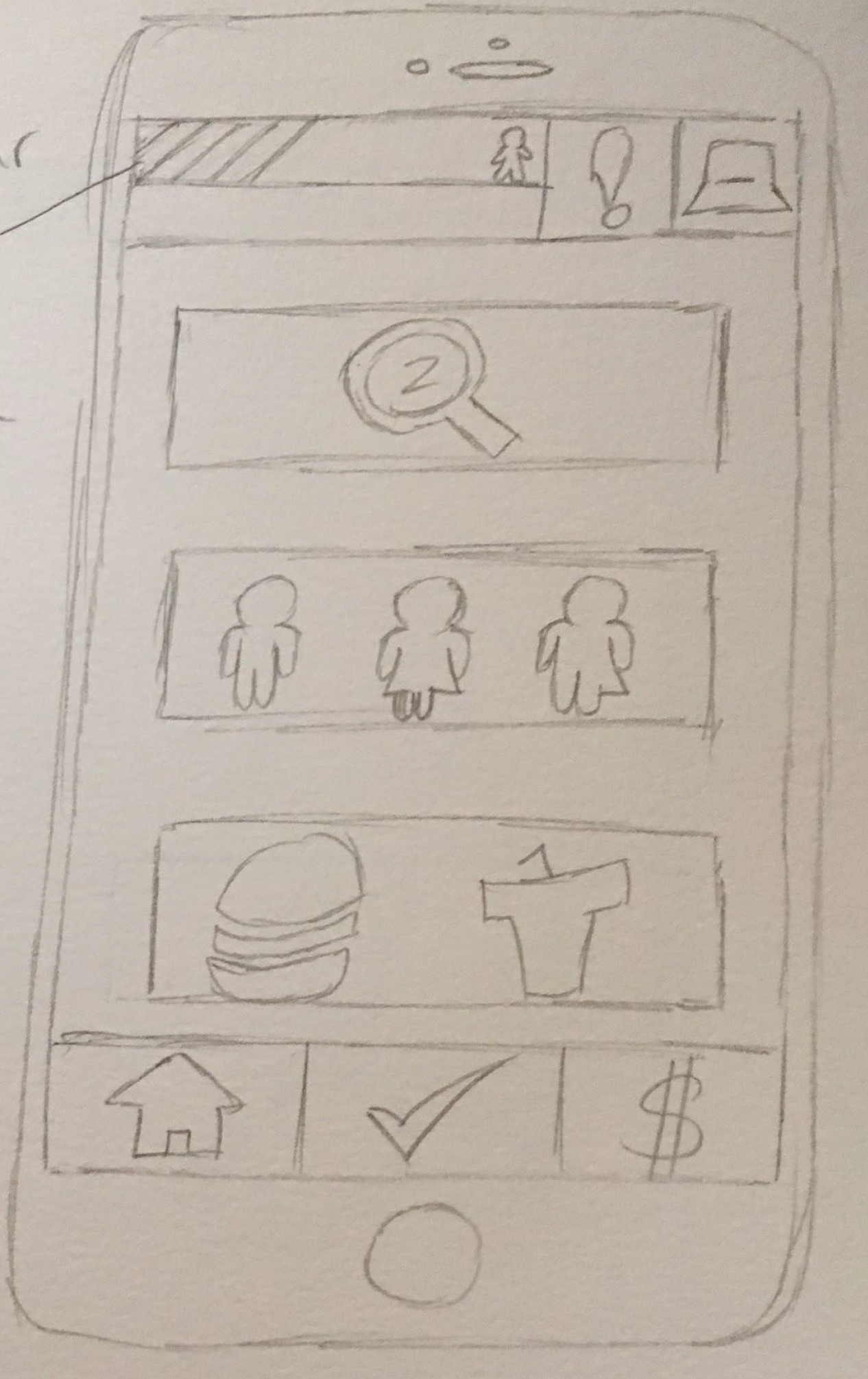
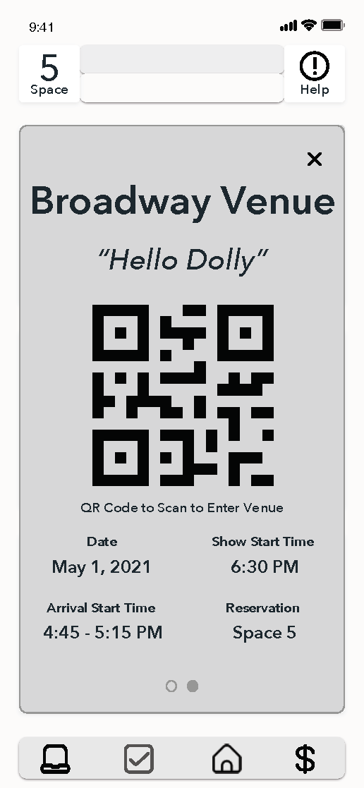
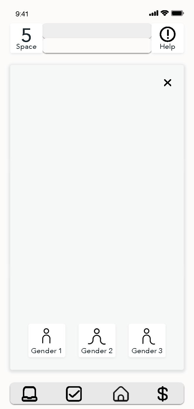
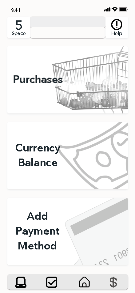
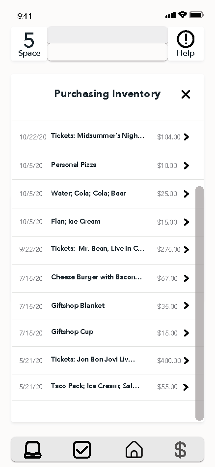
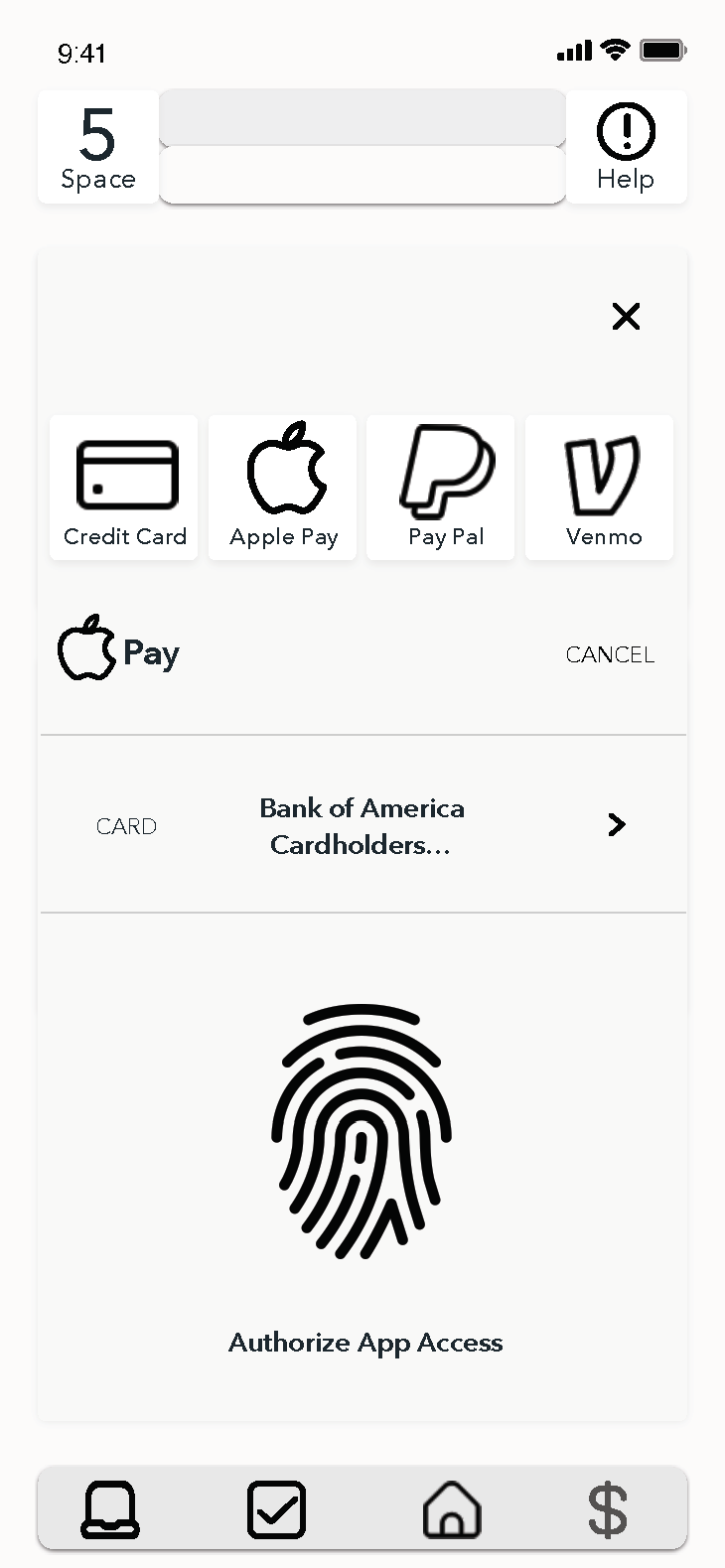
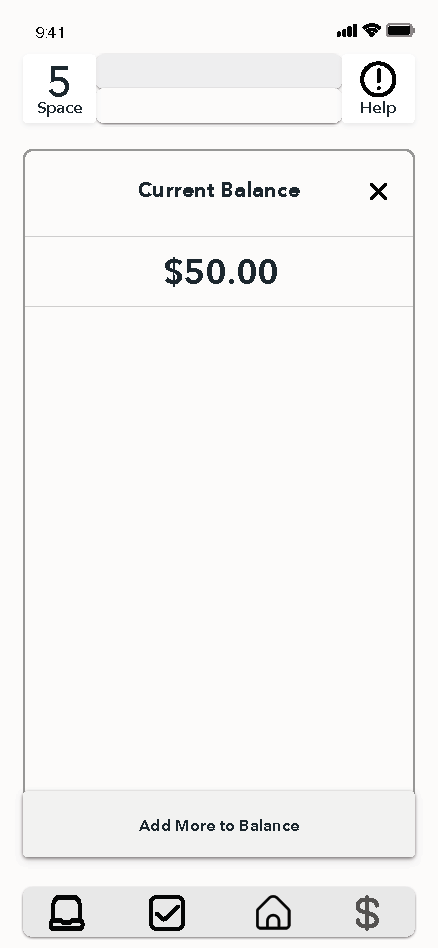
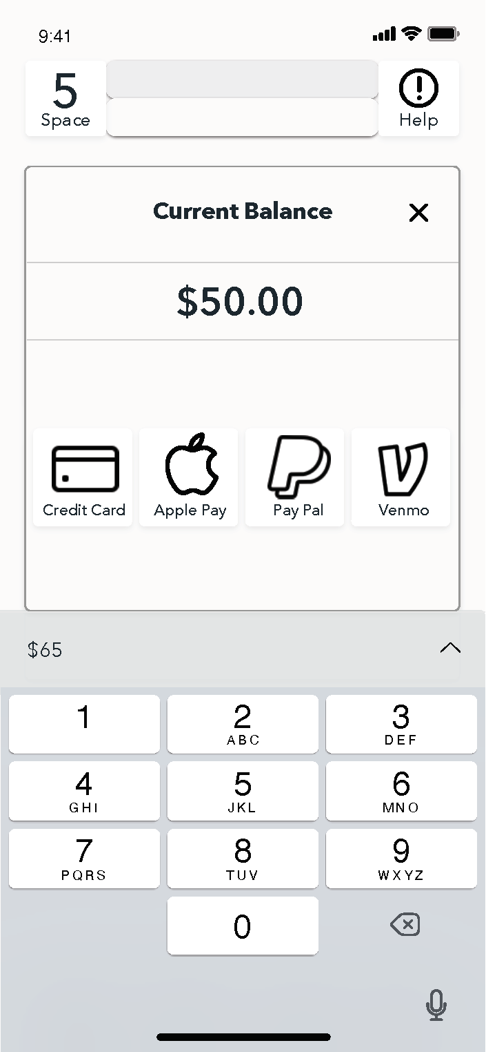
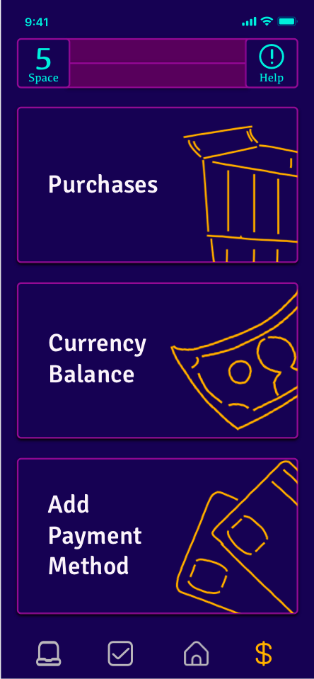
Simple Search is divided into five key features to address the primary and most significant needs and concerns of users: Navigation, Food, and Bathrooms take precedence, followed by secondary features, namely finances/payment support and tickets. Supplementary elements enhancing support include a link to the venue's website, offering additional information such as attendance rules, show schedules, and future events. Another essential support feature is an emergency button, designed akin to a flight attendant's call button, catering to the needs of atypical users requiring accessibility support.
The app serves as a comprehensive one-stop-shop for assistance during live performances. Originally developed to navigate the challenges of a pandemic, it has proven versatile beyond Covid-19, delivering a polished and personalized experience. Features like electronic bathroom queues enable users to stay in their seats, enjoying the show without missing significant portions while waiting in line. Food lines become a thing of the past, allowing users to avoid rushing during breaks or intermissions for snacks. The Navigation feature ensures users confidently access the venue's space, even in dimly lit settings.


Style Guide
The app's design was meticulously crafted with the product's objectives and the app's anticipated usage environment in mind. Opting for a dark theme was a deliberate choice to assist users in preserving their vision while navigating and operating the app in dark venues or theaters. A white or bright theme could potentially blind users when looking up from the app, leading to delayed movement or even causing injury. The dark theme is aimed at maintaining users' acclimation to the dim surroundings.
To establish hierarchy and delineate sections, the app employs bright accent colors sparingly, mirroring the aesthetic of track lighting or LED illumination typically found in theater venue aisles.
-
![Style Guide Color Palette]()
Color Palette
The color palette utilizes cool dark colors as primary colors to help with eye adjustment in a dark venue. The two brighter colors outline key features to help draw the eye to alerts and prmpts.
-
![]()
Typography
The typography chosen was to convey welcoming and technological accuracy. The app needed to be trustworthy and precise so users would want to use it verses trying to access and navigate the venue alone.
-
![]()
Icons
Icons in an active state are yellow to continue with accessibility in the dark and contrast with the cool colors of the background field. Inactive icons are greyed to convey unselected features.
-
![]()
UI Elements
UI elements are minimal, following the precision esthetic set up in the brand.
-
![]()
Mood Board
Inspiration for the esthetic of the app. The goal being dark, slick, and efficient.


Iterations
Informed by initial interviews, thorough research, and established design systems, a high-fidelity prototype was meticulously crafted. Subsequent to conducting moderated tests, multiple adjustments were implemented, taking into account the valuable feedback received and observations made during the testing process.
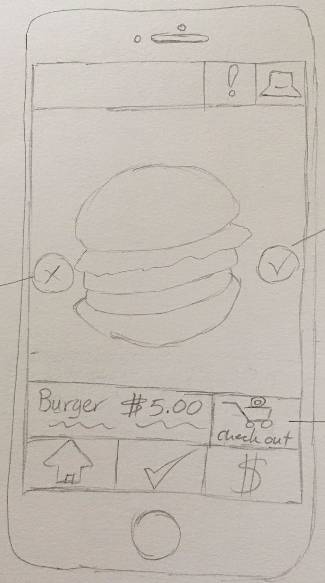
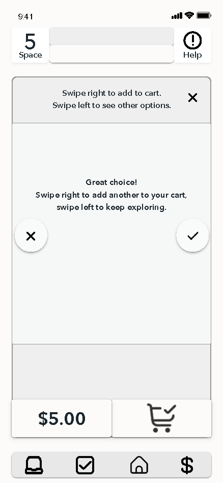
In this iteration and first prototype, the food feature of the application was set up to function similarly to a dating app where users could swipe right on the food they were interested in adding to their cart. This iteration also had a help button for emergencies, an icon to direct users to an external website owned by the venue, an icon to “check-in” to the venue.
The design of Simple Search embraces the night theme established in the style guide. This helps the user see the app and the dark venue simultaneously without affecting the user’s vision. In this iteration, the food option was set up in the style of a dating app. This was confusing to users universally - older users didn’t understand how the dating app setup worked (and how swiping left and right related to yeses and noes), while younger users who knew how to use dating apps became concerned that once they swiped left on a food item, they would not be able to select it again if they went through the entire menu and decided that was actually the best option on the menu to go back to. When conducting the usability testing, all users needed to be instructed on how to engage with this feature and have vocal prompts.

First Iteration


Findings
The food feature posed challenges, especially for younger users familiar with dating apps who were concerned about the inability to browse through all food options before swiping left, fearing the loss of other choices. For older users, the concept of swiping wasn't intuitive. Customizing food options proved non-intuitive for both age groups, leading to frustration with final pricing.
Certain icons caused confusion as they didn't convey the intended meaning to users. The check-in icon, for instance, was misunderstood by everyone, who thought it was a feature for viewing their purchases at the venue. The computer icon, signifying an external website, was unclear and didn't resonate with users, resulting in low engagement due to its ambiguous meaning.
The help button proved too tempting during the testing phase, getting pressed whenever users felt confused or sought support with their tasks. While it serves a crucial purpose to prevent people from aimlessly wandering the venue in search of services, it needs to be perceived as a last resort or reserved for emergencies.
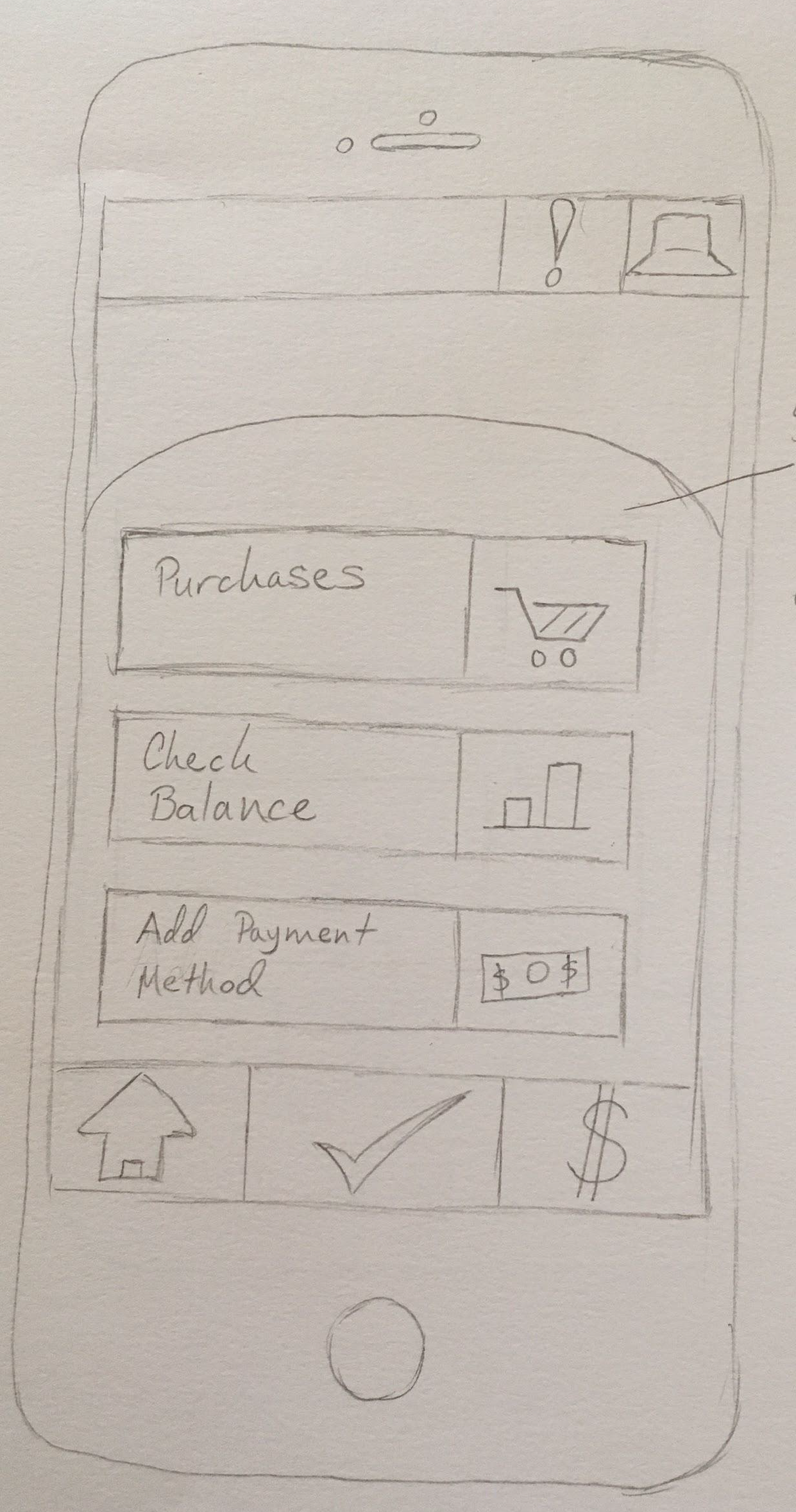
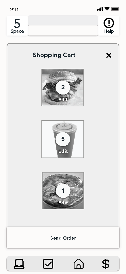
The above findings prompted a comprehensive overhaul of the prototype. The food feature was completely revamped, now functioning similarly to the photo app on iOS systems. This redesign allows users to view and sort all options before making a selection, enhancing customization of the food ordered. Additionally, the help button underwent a transformation into a Lifeline button. Interestingly, users refrained from pressing it when facing confusion during moderated tasks, with one user expressing, "Ahh, I can't use my Lifeline; I will save it for when I really need it." Though unintentional, this correlation with "Who Wants to Be a Millionaire" resonated well with testing subjects, proving impactful in user engagement.

Second Iteration


Conclusion
The Simple Search App garnered positive reviews following the second iteration. The revamped food feature significantly enhanced the user experience for usability testers, although some minor adjustments were identified, particularly in the customization elements, necessitating additional tweaks to the updated prototype.
As the United States gradually opens up with the vaccine rollout against Covid-19, the potential for reduced capacities due to variants remains, impacting venue operations. Meanwhile, other global locations continue to grapple with the effects of Covid-19, maintaining the need for ongoing social distancing efforts. Feedback from usability testing participants underscores the users' appreciation for the augmented experience provided by Simple Search, whether for adherence to Covid safety measures or streamlining various elements of the audience experience. A particularly charming takeaway from testing was the expressed interest in having the bathroom queue feature available immediately, with users acknowledging its practicality.
In essence, the app proves beneficial to those willing to engage with theaters and concerts amid uncertainties. Its utility extends beyond the Covid era, offering an improved focus on the show rather than the accessibility and logistics of enhancing the performance experience. Users no longer have to compromise between optimizing their view and ensuring creature comforts. Additional advantages include potential contributions to reviving the live theater and music industry, as well as supporting the recovery of lost jobs and services that have impacted communities and supporting businesses.