

PinPoint
Finding the perfect location to work just got easier.
Mobile App
PinPoint is a new startup where freelancers and remote workers share tips and advice.

The Problem
Users want an app that streamlines the process of identifying excellent public spaces for remote work, making it more convenient for remote workers.
The Solution
Leveraging research analysis, I conceptualized and designed an app dedicated to aiding users in discovering existing remote workspaces beyond their homes. The app systematically categorizes these spaces, providing users with detailed information on amenities such as Wi-Fi availability, access to power outlets, food options, noise levels, and more. This facilitates a streamlined process for users to pinpoint the ideal location for their remote work needs.

Role
UX Designer
UI Designer
Project Type
Design Sprint

PinPoint Prototype
Utilizing both Sketch and XD, PinPoint underwent prototyping to identify optimal navigation and incorporate visual cues, ensuring users seamlessly transition into an expert level of engagement.
Research
PinPoint asked users to tell them about their experiences finding a public place to work remotely from.
Interviews
9 users provided insight into how they make decisions about a place, how they find locations, and what they look for in a location.

Personas
The persona of Nina was developed, depicting an individual who invests considerable time in the search for suitable workspaces. However, she encounters challenges such as unreliable Wi-Fi signals, lack of restroom facilities, and the requirement to make a financial commitment upon finding a space.
Crazy 8
This exercise was utilized to come up with innovative ways to display the primary screen’s interface. The screen determined as the primary interface was the search feature of the app.
-

Sketch 1
The initial concept featured a layout where all locations were listed alongside their amenities, accompanied by an image on the right and concise descriptive text. This design drew inspiration from GPS applications like Waze and the default navigation systems found in many automobiles.
-

Sketch 2
This concept functions similarly to Google Maps, employing location pins to highlight all potential places in proximity to the user or the entered address. Users can explore further details by tapping on the specific location. This approach was influenced by user testing, which revealed that individuals commonly utilize Google Maps for discovering and assessing various options.
-

Sketch 3
Drawing insights from interviews conducted by the research team, this concept organizes locations by type and places a primary emphasis on captivating images of each spot, aiming to attract users and prompt them to make selections.
-

Sketch 4
Revisiting Google Maps, this concept reimagines the desktop version by relocating the list of locations below the map viewport instead of the traditional left-hand side. This strategic adjustment leverages the universally recognized thumb hotspot in design, enhancing user accessibility and interaction.
-

Sketch 5
Inspired by shopping apps, this design is crafted to enable users to "shop" for locations. It offers a quick-view criteria feature that assists users in swiftly navigating through results, facilitating efficient selections for further review.
-

Sketch 6
Taking a cue from Zillow's approach, this concept incorporates a similar functionality. Users can drag the viewport to explore various available locations, each accompanied by a concise high-level preview. The user can delve into comprehensive details by selecting a specific location of interest.
-

Sketch 7
Drawing inspiration from the Zillow concept, this idea retains the ability for users to drag the map and explore various results and locations. However, details remain hidden until the user actively engages with a specific location. Additionally, users can seamlessly switch between details by utilizing pill buttons for parameter filtering.
Storyboards
Following a comprehensive evaluation of user flows across various concepts, Sketch 3 emerged as the optimal choice to advance. This decision was guided by feedback emphasizing the significance of visual representations of locations and the specific location types. Subsequently, storyboards and sketches were meticulously compiled to identify fundamental user journeys, expediting the digital mock-up process and saving valuable time.
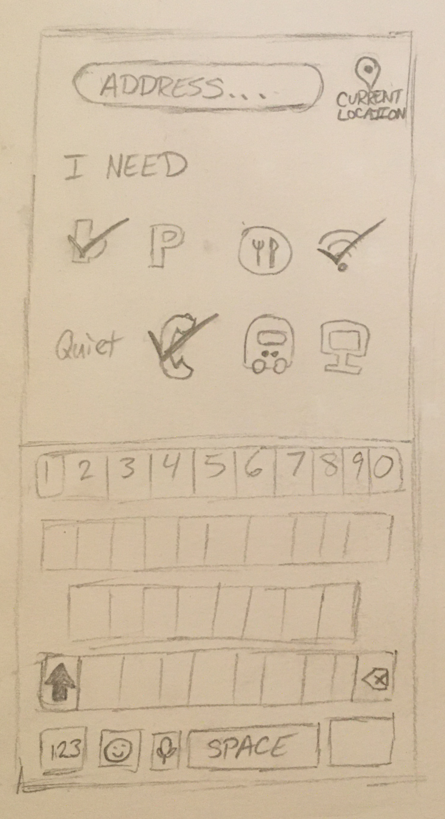
Onboarding
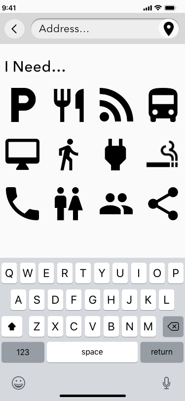
Upon launching the app, the onboarding screen initiates user input by prompting them to either enter an address or grant access to their current location for nearby searches. Subsequently, users are guided to specify essential features at potential work locations, streamlining the results to meet their optimal working environment. The keyboard option is available for address input, particularly useful for users in non-relative areas or those who prefer not to enable GPS tracking.

Results
Once the address and desired amenities are entered by the user, the app seamlessly transitions to a results screen. Here, all locations aligning with the user's specifications are presented in a row and grid format, featuring distinctive "album cover" images as a compelling call to action for each location. The results are categorized by location type (e.g., libraries, coffee shops), enabling users to scroll through images, accompanied by ratings and distances. The user can then make a selection to view more details about their chosen location.

Details
Inspired by the user-favored details section layout of Google Maps on desktop, our design enables users to explore additional venue details, including extra photos, ratings, and operating hours. The user can also efficiently filter reviews based on specific areas of interest, such as noise levels, crowds, and food, enhancing the overall user experience.
Iterations
Informed by initial interviews, research insights, and established design systems, a medium-fidelity prototype was crafted. Subsequent to conducting moderated tests, adjustments were implemented to address feedback and observations gleaned during the testing phase.
In this initial iteration and prototype, a semi-high fidelity design was crafted. Notably, the focus was on refining the images within the profiles.

First Iteration


Findings
The app's design received positive feedback overall, particularly for its location feed, which performed well during testing. The uniformity in displaying location information contributed to the ease of navigation, with almost all participants swiftly grasping how to explore and retrieve information when prompted. The app's intuitive nature was evident as 4 out of 5 users progressed through the selection process swiftly, even ahead of moderator prompts.
While most icons were well-received, one exception prompted feedback suggesting that using illustrations might better convey the sought-after amenities. Additionally, users faced a challenge in recognizing scrollable images at the top of the location information feed, indicating a need for higher fidelity in the prototype compared to the initial iteration.
One noteworthy comment from a retired user expressed a strong inclination to have used the app during their working years, suggesting a high level of perceived utility. They commented, “ “I would have used this had it been available while I was working - it would have been on my home screen.”
Conversely, a 24-year-old user preferred sticking with Google Maps, despite the feed being designed to resemble it. In response, a second iteration with higher fidelity elements was crafted, aiming to enhance visibility and address some of the harder-to-discern attributes caused by the initial monochrome styling.
In this second iteration of the prototype, enhancements were made to increase the fidelity of selected location profiles. Actual pictures were incorporated into the hero section, and adjustments such as reducing the transparency of scroll bars and changing their color contributed to users' awareness that they could swipe to explore more about the location and evaluate the place.
Following these improvements, the PinPoint app garnered positive reviews. Users reported an increased level of comfort with navigation, and the utilization of interactive features saw a notable improvement with the introduction of the higher fidelity iteration.
Second Iteration
Conclusion
The current PinPoint app design has been crafted to incorporate intricate details, ensuring users enjoy a realistic and immersive experience. Users have enthusiastically embraced both the product and its design, eagerly anticipating the moment they can put it to use in real-life scenarios.