

Subscription Stream
Discover how money is leaving your wallet!
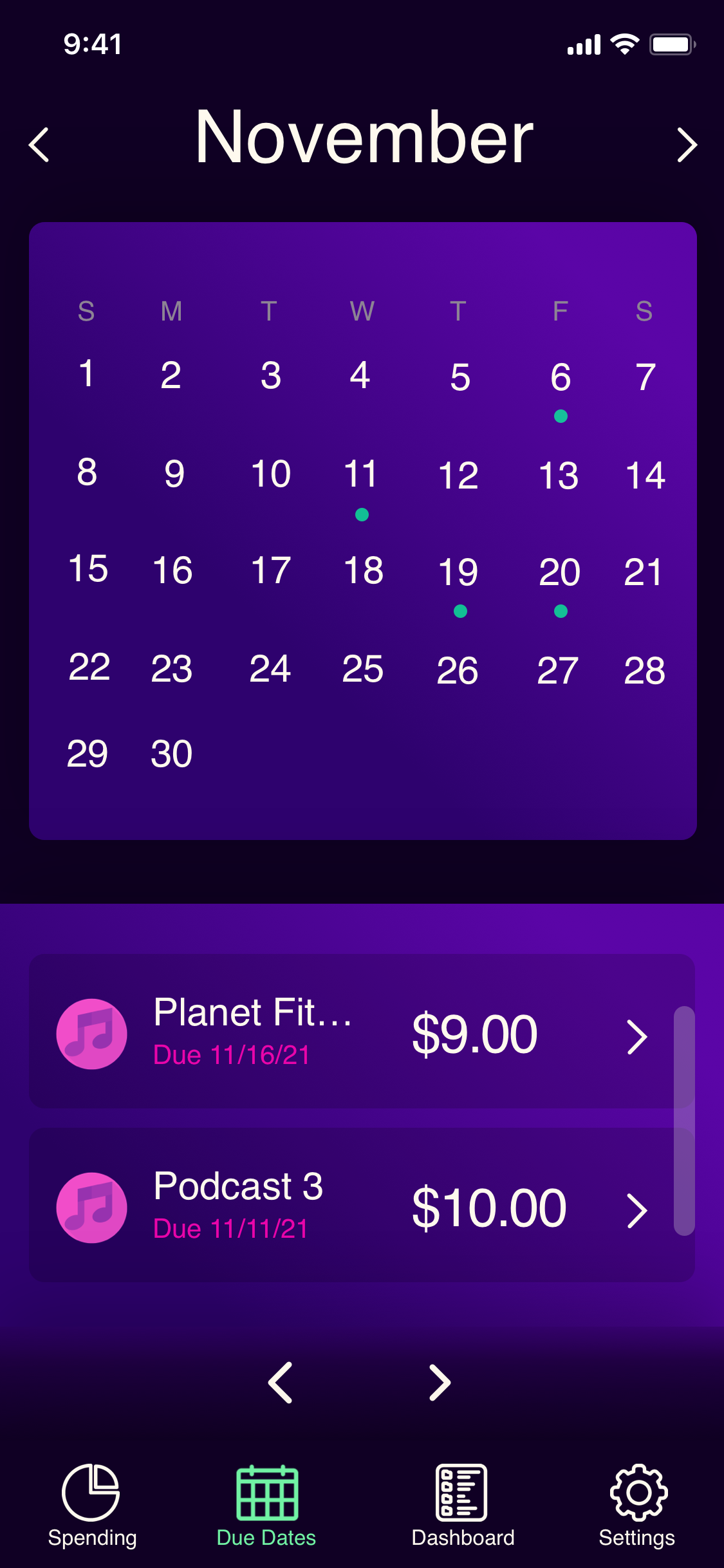
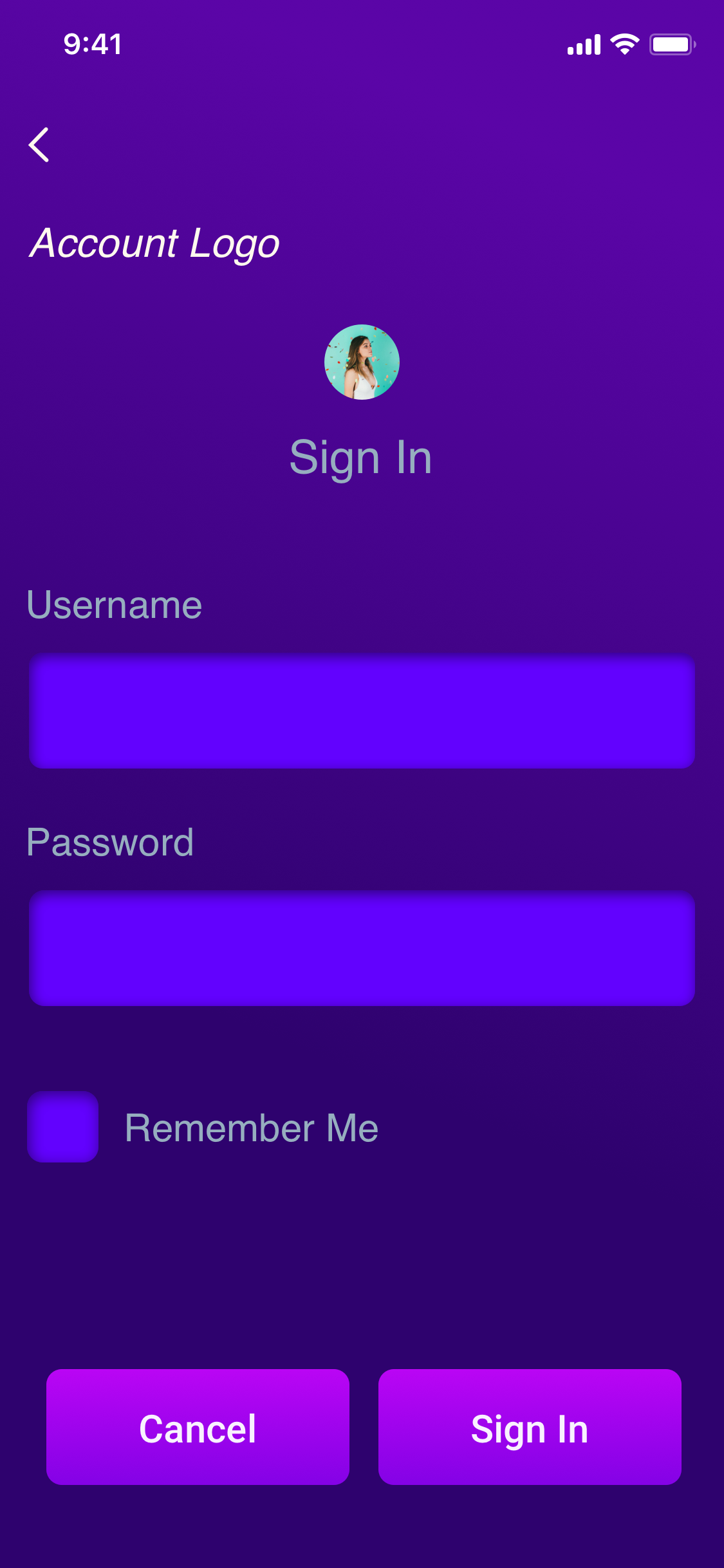
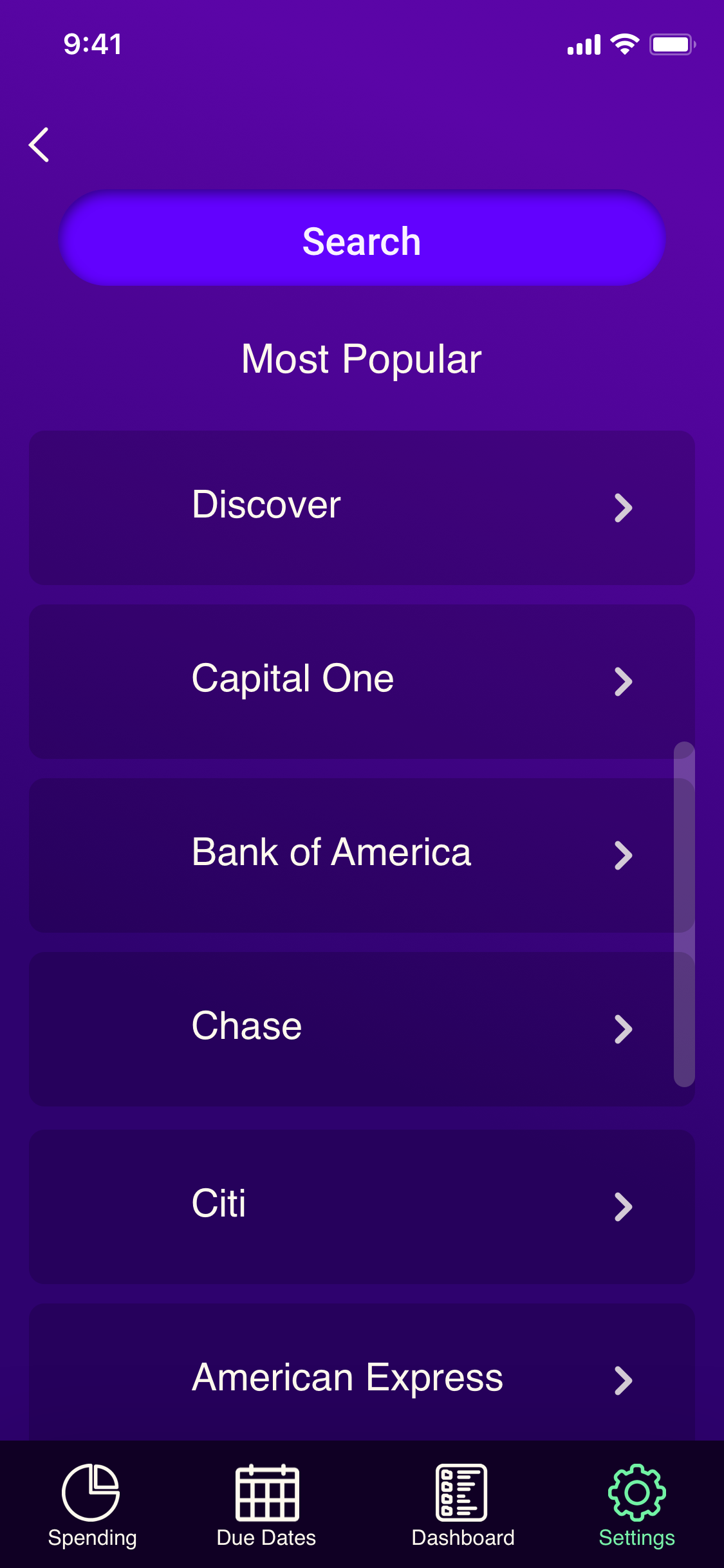
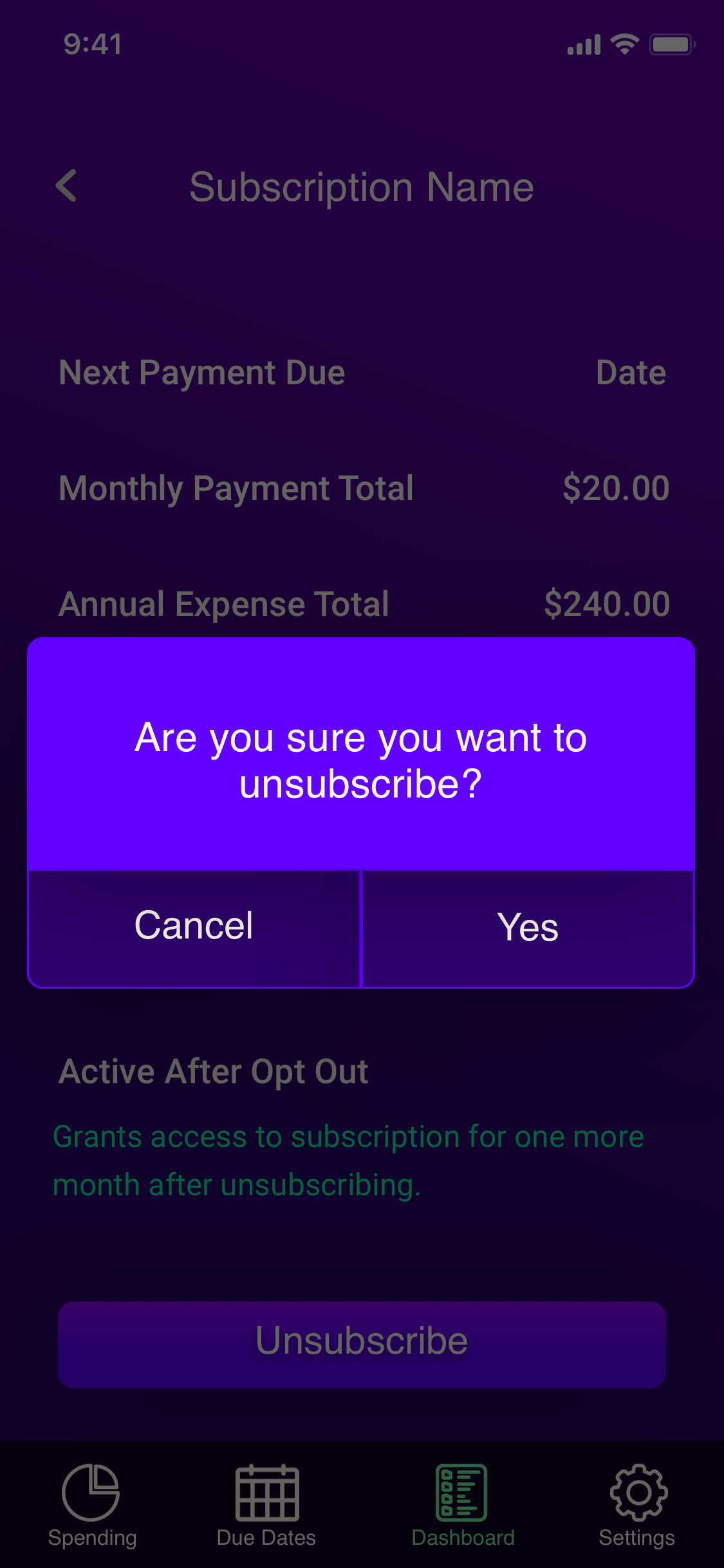
Mobile App
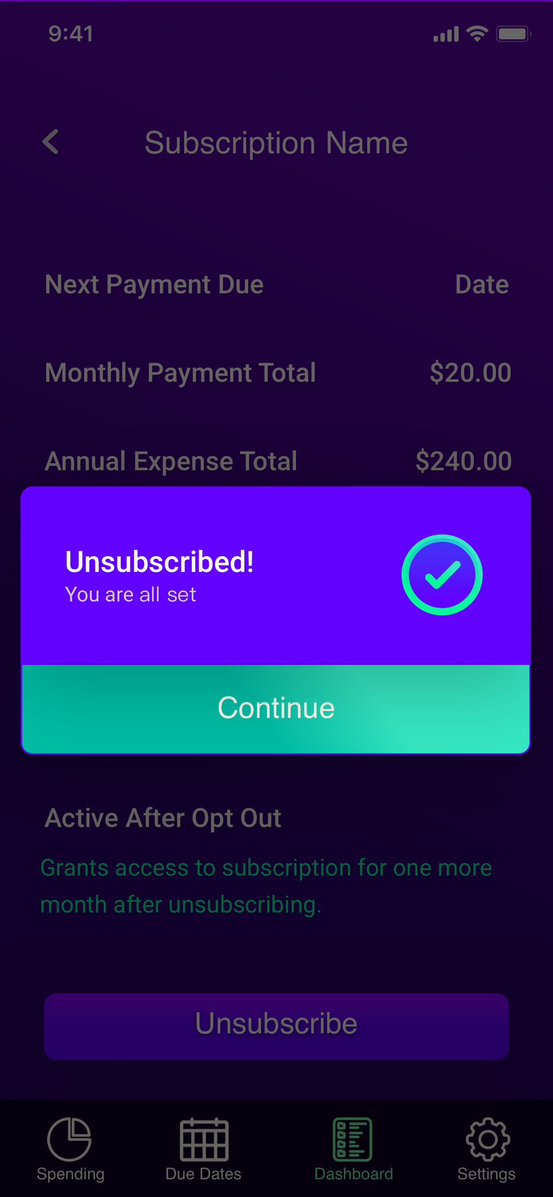
The Subscription Stream platform empowers users to effortlessly discover, monitor, and oversee all their subscriptions, renewals, and recurring charges, consolidating these vital aspects into a single, easily accessible hub.

The Problem
Users can quickly accumulate charges due to the multitude of subscription types available and the various payment methods. The costs can escalate when users find it challenging to locate and manage their expenses
The Solution
Leveraging research analysis, I conceptualized and developed an app that not only established a virtual bathroom queue but also facilitated users in navigating the venue independently. Furthermore, it provided a seamless experience by allowing users to order food delivery directly to their assigned seats.

Role
UX Designer
UI Designer

Project Type
Non-profit

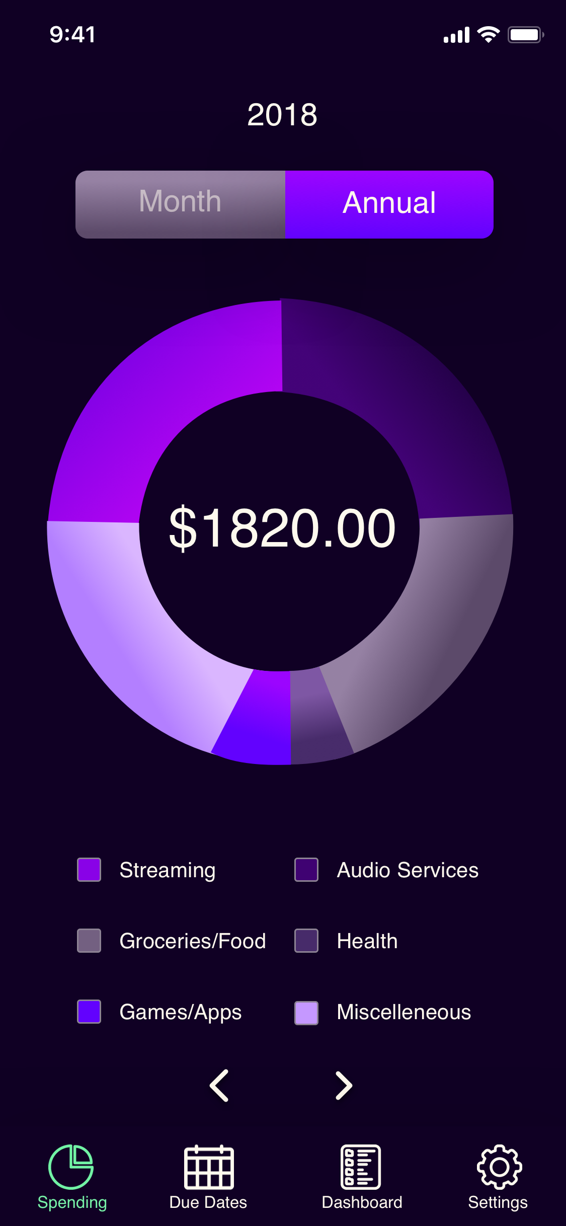
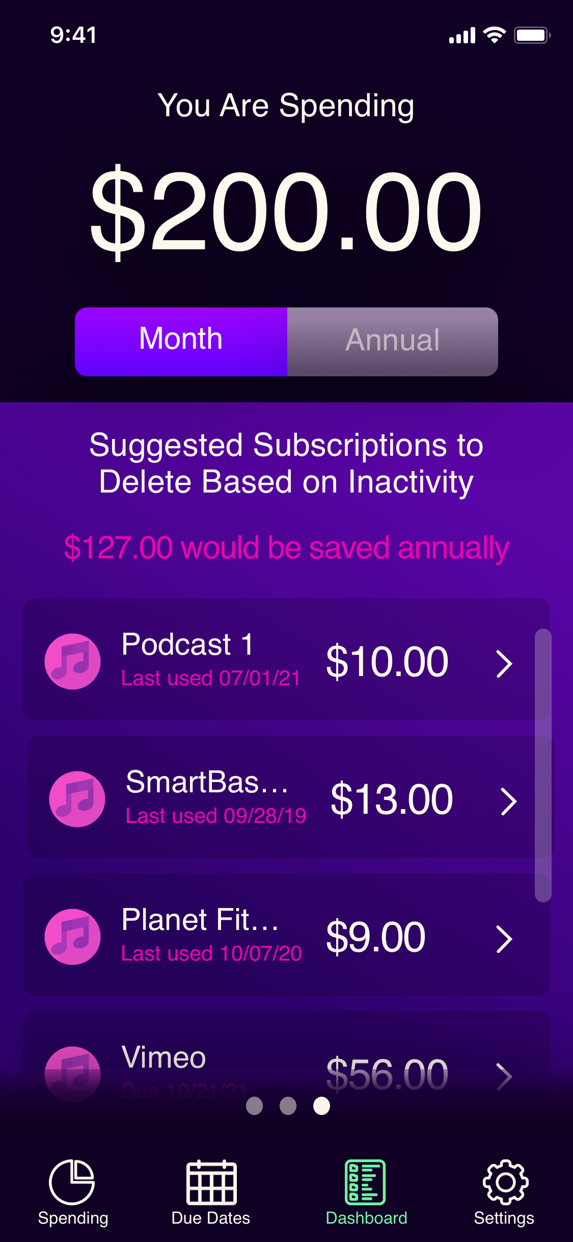
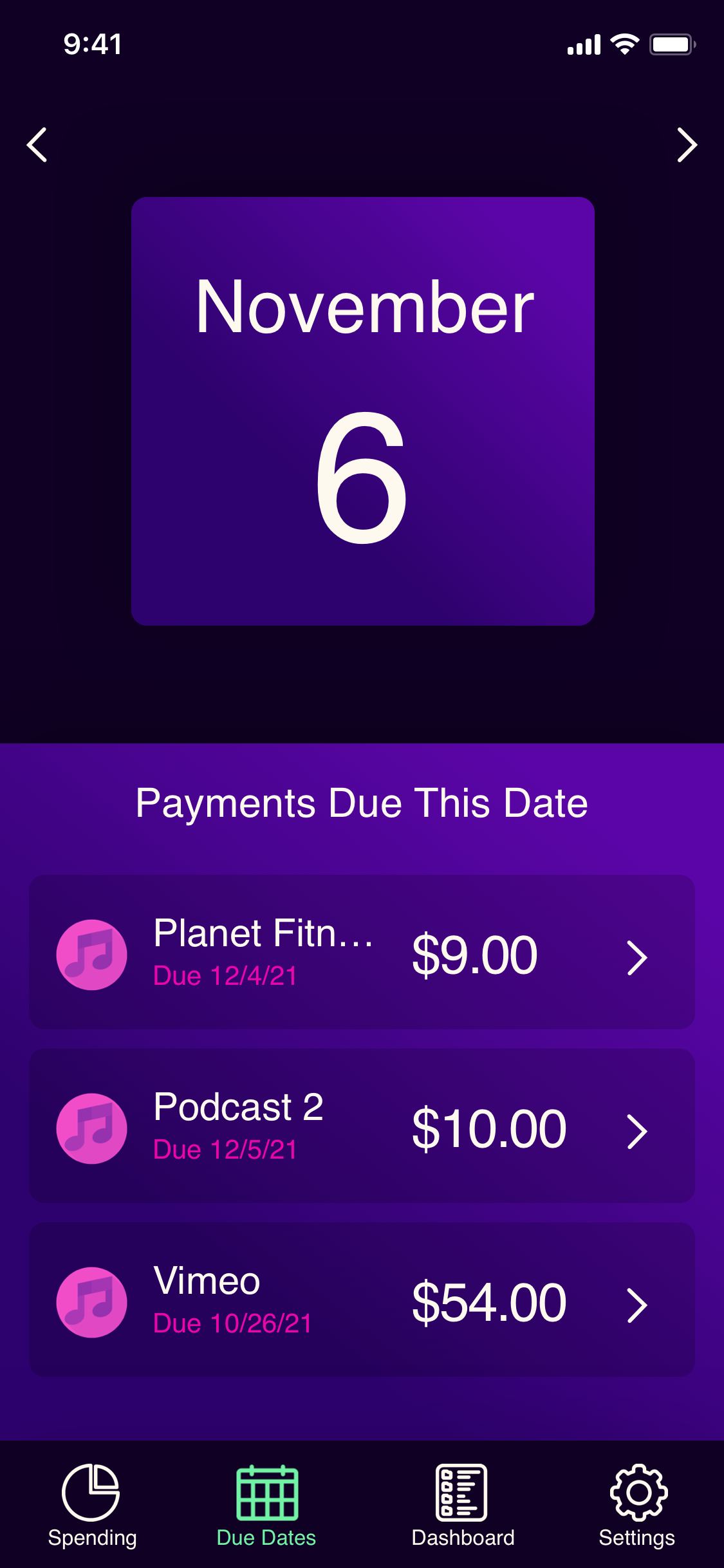
Subscription Stream Prototype
Utilizing Sketch and XD, we prototyped Subscription Stream to identify optimal icons, navigation, and visual cues, streamlining the user experience for a seamless transition into an expert-level user

Research
Upon administering a screening process targeting smartphone users attending live theater and/or concerts, we selected five survey participants who met the necessary criteria for conducting interviews. These individuals unveiled specific needs and concerns that were not initially accounted for in the project.
Personas
Company representatives shared their existing user demographic along with their envisioned target audience, aiming to augment the current user population and drive an upsurge in traffic to their platform.

Secondary Research
Upon receiving the target user specs, I reviewed apps that served similar functions to the features required of this mobile platform.

Synthesis
The research findings were systematically organized for comparison in a heuristics report, allowing for a comprehensive assessment against themselves.

Red Routes
Storyboards and Sketches
Storyboards and sketches were assembled to identify and save time on the digital wireframes.


Concept Sketches
Illustrations showcasing the app's interface and functionalities were meticulously crafted to ensure alignment with user needs. The app's layout adheres to standard iOS design principles, encompassing familiar iconography and layouts seen in comparable applications. To assess the design's practicality and identify potential areas for improvement, the Marvel App was employed to address any significant issues. The resulting mock-up elicited positive feedback, with an immediate inquiry: "How do I navigate back to the main dashboard displaying all my subscriptions after exploring the calendar or spending functions?"
Iterations
Based on the initial interviews, research, and design systems, a high-fidelity prototype design was rendered. After moderated tests were conducted, several changes were made based on the feedback provided and observations made during the testing.
First Iteration

In this initial prototype, the food feature of the application was designed to resemble a dating app, allowing users to swipe right on the food items they wanted to add to their cart. This version also incorporated a help button for emergencies, an icon directing users to an external website owned by the venue, and an icon for venue check-ins. The design of Simple Search embraced a night theme from the established style guide, facilitating simultaneous use of the app in dark venues without affecting users' vision.
However, the dating app-style setup for the food feature proved confusing for users universally. Older users struggled with the unfamiliar interface, not grasping the connection between swiping left or right and accepting or rejecting items. Younger users, familiar with dating apps, expressed concerns about being unable to revisit a food item once swiped left, particularly if it turned out to be the preferred option after reviewing the entire menu.
During usability testing, it became apparent that all users required explicit instructions on how to navigate and engage with this feature, leading to the realization of the need for vocal prompts.
Findings
The food feature proved challenging for users, particularly among the younger demographic accustomed to dating app interfaces. Concerns arose about the inability to browse through all food options before making selections, akin to the swiping mechanism on dating apps. This raised anxiety about potentially losing access to other food items by swiping left, mirroring the dating app experience. On the other hand, older users found the swiping functionality unintuitive. Customizing food options also posed challenges for both age groups, leading to frustration with the final pricing.
Additionally, certain icons in the interface caused confusion. The check-in icon, for instance, was misunderstood by users who expected it to lead to a view of their purchases at the venue. The computer icon, symbolizing an external website, failed to convey its meaning effectively, leaving users uncertain about its functionality and less likely to engage with it due to its ambiguity.
The help button proved too tempting during the testing phase, leading users to press it whenever they encountered confusion or sought assistance with their tasks. While there is a genuine need to prevent users from aimlessly wandering the venue in search of services, the button should ideally function as a last resort or for emergencies. This behavior observed during testing suggests a need for refining the button's prominence or providing clearer guidance to discourage unnecessary usage.
Second Iteration

The aforementioned discoveries prompted several modifications to the prototype, including improved alert systems, a more detailed and refined user journey, and the establishment of a comprehensive style guide.


Conclusion
The iterative design process for the Simple Search app revealed crucial insights through user testing and feedback. Addressing challenges such as the dating app-inspired food feature, confusing icons, and the prominent help button, the design underwent significant refinements. Incorporating user-friendly elements, refining functionality, and establishing a coherent style guide, these adjustments contribute to a more intuitive and user-centric experience, addressing the diverse needs and concerns identified during the development stages.